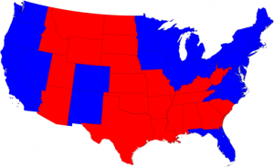
So the 2008 election results look like this:
Looks like a pretty close race from this picture. In fact, it looks like the Republicans might have won. The problem is that “size” in one sense doesn’t matter. It doesn’t matter how big the state is, if not many people live in it. Likewise, it doesn’t matter how small the state is (e.g. New York) if a lot of people live in it. Electoral votes are given out based on the population size of each state, not on its geographic size.
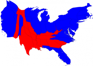
So taking this into account, if we reshape the US and make states “larger” that have more electoral votes, and states “smaller” that have less, we end up with this cartogram:
That shows quite a bit of difference. Here the Democrats clearly won.
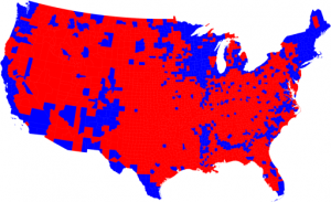
But what about by counties? How did each county in the US vote in the 2008 general election? Here it is:
Again, looking at just this it would appear there was a convincing victory for the Republicans. But, alas, this cartogram, fails to take into account the size (not geographic-wise, but population-wise) of each county. Doing this, gives us the following cartogram:
Again, this shows a convincing victory for the Democrats.
All pictures were taken from here.


Hmmmm, very interesting.
We thank God that He is in control. He gave safe and peaceful elections.